Saturday, September 4, 2010

New Work

I just finished two pieces for the latest ArtCloth Network exhibition. Els van Baarle is the juror and we'll know in mid-October which pieces are accepted.

My pieces are inspired by my continuing fascination with humans’ tendency to focus on anything but the present moment. We often spend most of our time either anticipating a date in the future or reliving a day in the past. It may manifest as remembering happy times or feeling regrets over what we did or did not do.  Or we may spend time worrying about something that may (or may not!) happen.  Many of us find it difficult to focus on the current moment – to give our attention to the people and circumstances that currently surround us.  These pieces represent my own journey, my quest to move from marking time until a future event to living in the present and fully enjoying this moment.

My vision was to use two pieces of cloth that complement each other and represent the dichotomy of these two ways of being. I used silk noil and incorporated soy wax resist with multiple layers of dyeing, discharge and overdyeing.  I also added some handstitching and metal leaf.

Marking Time


This Moment


Wednesday, September 1, 2010

Old Habits Die Hard

If you follow my blog, you'll know that I am trying to reduce my dependence on silkscreens and thermofaxes.  So I didn't plan for any screenprinting on two pieces I am creating for the ArtCloth Network exhibition.  But one of the pieces needed a little something, so my solution was a thermofaxed image.  I had just the image in mind.  I drew it and rushed off to the studio to make the thermofax. 

The machine seemed to be working fine, but the image didn't burn into the screen.  A moment of panic, then I realized I must have had the wrong side against the paper.  Try again.  Still not working!  Hmmm.  It worked fine a few weeks ago. Maybe there isn't enough carbon in the photo copy. Oh no, now what?  I could make a stencil.  I know, I'll draw it with india ink.  That works instead of a copier to burn a thermofax.

So I brushed my design on paper with india ink. Ran it through again.  Still not working.  Panic set in again.  I have to get this finished by tomorrow!  .......Then the irony of it all hit me.  I said I wanted to limit my use of thermofaxes and what is the first thing I turned to under stress?  But the Universe was teaching me a lesson.  "You really want to focus more on painting directly on cloth?  OK, I'll just take care of the temptation from that nasty thermofax machine."

So I steeled my nerves, took out that big beautiful $20 paintbrush I've been saving for something "special", and started painting.  The design was very simple, so why did I even think I needed a thermofax? That old fear that I will screw it up came creeping back in. With a thermofax, one can practice, test it and figure out exactly what it will take to get a perfect image.  But with handpainting, there's a good chance it won't be "perfect".  As I struggle with my perfectionist handcuffs, I am coming to accept and appreciate the "imperfection" of a hand painted image.

Sunday, August 29, 2010

I See a Pattern Here...

When I came up with the idea of doing a series of pieces all with a similar vertical line composition, I thought I was doing something very different from my other work.  But then I became more aware of the composition of some of my pieces from earlier this year. 


Hmmm, I guess the vertical lines aren't so new after all.

After I noticed this pattern, I wondered what it was that drew me to the vertical composition. I see the vertical line as a symbol of growth, of a connection between the physical and the spiritual, between the earth and sky.   It also represents the chakras and the energy that moves up through our body, keeping us grounded to the earth and also connected to Spirit.  To me, the vertical line also represents a moment in time - this moment, which is all we really have. 

What does the vertical line represent to you?

Thursday, August 26, 2010

Fat Quarter Studies, Part 1

I've been working on fat quarter studies in preparation for my assignment in the ArtCloth Mastery program.  I have about 8 pieces in process right now.  My plan is to use a similar composition style for all of them, incorporate a variety of resists and do color studies with intensity and complements. 

First, I have to say I am having a blast!  This is a whole new world for me - handpainting directly on the cloth  - no silkscreens or thermofaxes.    My original inspiration came from Helen Frankenthaler.  One of our assignments for the last class was to prepare a presentation on an artist.  Then I studied other artists from the same period.  I felt drawn to make marks on cloth with my own hands (and the use of some tools!) rather than relying on stamps, stencils and silkscreens.

I was talking with a friend (and artist) the other day about her current project.  She has been having a difficult time finding just the right imagery for her project. She has spent hours researching and working with photoshop. I know exactly how she feels, because I've gone through that numerous times. As we talked, I realized how free I feel working on this series because that is not an issue. 

Here are photos of the three pieces that are "finished".  Not in the ready-to-hang sense, but in terms of any dyeing, painting, etc.


Zip I


This is silk broadcloth. It was inspired by Barnett Newman.  His work features vertical lines, which he calls "zips".  He tends to use more solid colors, but I wanted to create a softer look. No resists on this one, other than the masking tape.  But I'm thinking of a redo, using sodium alginate as a resist.


Fault Line


This is a silk/soy blend.  Great fabric available from Thai Silks.  The silk side is satin, the soy side is similar to a broadcloth.  Because of the blend, the colors are different on each side.  I started with a flour paste resist, then mixed up red in four intensities and used a credit card to scrape the color onto the cloth. This one is my favorite so far.

Stability Amidst Chaos


This is silk broadcloth.  I started with soy wax to block off the circles in a vertical line.  Then I used flour paste brushed on in circles to create the texture in the background.  Then several layers of hand painting with blue and orange dye and just a touch of copper leaf.

Five more in the works - I'll post more as I finish them.

Monday, August 23, 2010

Everybody Needs a Little Lovin'

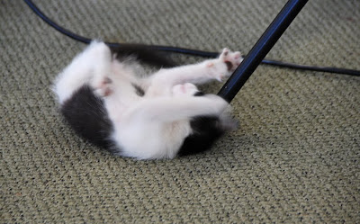
Every morning as I work at my computer, our youngest cat, Babs, comes wafting in with a pathetic "eeeyooo".  She walks by, gently brushing my legs with her soft fur. That's my cue that it's time to pick her up and hold her like a baby.  She "assumes the position", with paws up, head back, waiting for me to stroke her face and scratch her chin.

This all started about a year ago.  As she got older and heavier, it hurt my arms to hold her for very long.  So I came up with a new way to hold her - like a baby, with her weight resting on my lap. It quickly changed from something I did on occasion, to something she required daily.  We have come to call this daily ritual "Babs getting her 'mornin' lovin'."


It isn't just limited to the morning, however.  We have learned that if she is acting up and getting into things, she just needs a little lovin'. Babs scratching the sofa- give her some lovin'!  Babs knocking things off the table - give her some lovin'! Problem solved instantly.

The other day, my husband came home complaining about a crabby woman he had encountered that day.  She was yelling at everyone, family, strangers, whoever came into her path.  I jokingly blurted out, "she just needs some lovin'!"  And then I thought maybe there really is something to that.  Doesn't everyone need a bit of attention, to feel loved and respected?   Can you imagine what the world would be like if we all had a little "lovin'"?

Now stop snickering - I'm not talking about anything X-rated.  Just a little attention and affection.  Think about your morning routine.  It's so easy to get caught up in the chaos - rushing around, watching the clock, doing chores, making lunch, etc.  Do we give our loved ones our complete attention?  Do we let them know how important they are to us? Maybe just the simple act of being truly present with another person for just a few minutes could change the course of their day.

So, here's my challenge to you this week, should you choose to accept it.  Make a point of "giving lovin'" throughout the day.  Give people your complete, undivided attention. Let those who are important in your life know how you feel. And let me know what happens!

Friday, August 20, 2010

My Latest Project

I'm a bit behind on the cloth I need to finish for the next ArtCloth Mastery Program session.  We are supposed to create a series of 4-6 pieces of artcloth.  Of course, I have all kinds of good reasons for not starting before now.  One of the main reasons is that, up until 2 weks ago, I did not have a plan.  All I knew was that I wanted to incorporate hand painting.  I finally had a brainstorm as I lay awake one night. 

I've been focusing a lot on design and composition since I started my daily design practice last fall.  (Actually it was more of a weekly practice, but that's another story.)  I've always taken an intuitive approach to composition.  But since I don't have a formal art education, I figured it was time for some "book learning".  I've been reading and doing a variety of small design and composition studies to translate the book learning into experiential learning.  I have also managed to incorporate design concepts into each of the classes I taught this year.

Through my design work and research on other artists (I've focused on the abstract expressionist movement) I find I've been drawn to vertical compositions.  I used that approach for one of the pieces I created for my last series, The Best Season, and I was really pleased with the end result.


So, I decided that I would use a vertical composition for all the pieces in my next series. There are a few other things I want to accomplish with this series, so here's my plan:

  • All pieces will have a vertical composition
  • All pieces will incorporate the use of resists
  • All pieces will be primarily hand painted with minimal to no use of silkscreens
  • Each piece will be a color study, incorporating either complements, or some color scheme based on color wheel relationships
I have started doing a series of fat quarter studies and then I will start on the larger pieces.  Stay tuned for photos as I work through the small studies.

Monday, August 16, 2010

Potato Dextrin Resist

I've been working a lot with different resists over the past few years and wanted to revisit potato dextrin.  I first used it about six years ago and loved the crackle pattern it produced. I have also experimented with mashed potato flakes, because they are inexpensive and easy to obtain - no shipping charges!  I've been using flour paste to get a crackle pattern lately, so I wanted to play around with the dextrin again. 

Below are a few photos from my experiment last week.  For the mashed potato flakes I used about 1/2 cup potato flakes to 1 cup hot water.  For the dextrin, I used about 1 1/3 cup dextrin to 1 cup hot water.  I spread the paste on with a squeegee and used the sgraffito technique to scratch into the wet paste.  After the paste had dried, I applied thickened dye.


This shows the mashed potato flakes using the sgraffito technique.  I scratched into it with a bamboo skewer and placed a lace doily, bubble wrap and a rubber rug gripper on for texture.


Another example of mashed potato flakes applied with a squeegee.


This is potato dextrin, applied with a squeegee and then I embedded objects in the moist paste to create pattern and texture.  I didn't get the nice crackling I expected, nor much patterning, but I blame my impatience.  I applied the dextrin while it was still hot.  It needs to cool somewhat before using so it thickens properly. It went on as a very thin coating, which didn't crack much when dried.


This is also potato dextrin. I stamped it on and applied it with a brush.  I had forgotten how well it works as a resist when stamped onto the fabric.


I am currently doing some fat quarter studies, layering different resist techniques.  This is one of the studies using potato dextrin.  I brushed the dextrin through a large plastic grid. I left the grid on until the dextrin had partially dried.  Very interesting!  Today I'll work on the next layer of color.


Wednesday, July 28, 2010

What Do You See?

I've been intrigued lately with the research indicating that we tend to discount facts and data that contradict our beliefs.  We like to think we are open-minded, but we tend to dig in our heels and stick to our position.  We tend to see what we want to see and hear what we want to hear.  It seems like every few months there is a story on the radio about new research or a new book on the topic. 

I faced it first-hand recently.  A friend of mine uses a different technique for dyeing fabric than I do, and she feels she gets more vibrant colors.  She decided to do a side-by-side comparison of the two methods.  I didn't really feel that I was tied to my way of doing things. I was interested to see the results, to see if it was worth trying her technique.  She showed me the the samples, and just as I was thinking, "Hmm, not really that much difference between the two.  I guess it doesn't really matter."  she said something like,  "So you can really see the difference - how much brighter the colors are with my method."  My first thought was that she  was so attached to her method, she saw what she wanted to see in the samples.  She believed her method produced more vibrant colors, so that's what she saw.  And there probably is some truth in that, but I was doing the same thing.  When I first looked at the samples, I did see a difference, however it didn't seem significant to me.  Not significant enough to change the way I was dyeing.  So then my brain ignored the difference that was there.

It just amazes me that we were both looking at the same "facts", but we each saw something different. I like to think I'm open-minded, but I see how easy it is to get caught up in that way of thinking.  So the question is how to remain open to new information.  I suppose awareness of these tendencies is a good place to start. 

Thursday, July 22, 2010

Fear

I had one of those flashes of brilliance a few weeks ago.  You know - you're lying awake at 3 in the morning and all of a sudden you get a great idea.  Lately I have been uninspired as far as creating goes.  I've been putting so much energy into creating and teaching workshops that I haven't made studio time for myself.  And the less time I spend in the studio, the fewer great ideas I seem to have. 

So, after a dry spell, I was excited by my 3 am musings.  I was out of town at the time and couldn't wait to get home to try out my ideas.  But when I got home, there never seemed to be time.  Every day something else seemed more important, or at least more urgent.  It finally hit me that my procrastination wasn't due to lack of time, it was fear.  I know it sounds strange, but I was afraid to try out my idea.  I think it's because it sounded so great and had such interesting possibilities, I was afraid I would try it and it wouldn't live up to my vision.

When I realized what I was doing, I made myself go to the studio and play with my idea.  I had a blast!  I'm not completely pleased with the results, but I think a little tweaking will do the trick.  So, lesson learned.  Sometimes you just have to jump in.  You'll never know if an idea will work unless you do.

Friday, July 16, 2010

Oatmeal on Cloth

Last week I created some samples of cloth using oatmeal resist for a demo I'll be doing later this year.  I've done a lot of work with oatmeal, but I wanted to have a complete set of samples showing how altering the variables affects the cloth.  After creating these samples, I have a renewed enthusiasm for oatmeal. 

I started working with oatmeal as a resist about 5 years ago.  It's a little more involved than flour paste, but it creates a very distinctive pattern.  It is also very versatile.  You can achieve vastly different patterns depending on the ratio of water to oatmeal, whether you let the oatmeal dry or not before handpainting and whether you handpaint or immerse.  Below are photos of a few of my samples.


Oatmeal on silk


Hand painted while the oatmeal was still damp


Oatmeal applied with a spoon.  Looks kind of like popcorn, doesn't it?


Immersed instead of hand painted.  If you look closely you can see the paw prints where my cat
jumped up and did "the slide".

Friday, July 9, 2010

Color Studies


I've been so focused on my summer workshops, I haven't spent much time in the studio working on my assignments for the ArtCloth Mastery Program. The little I have done has been centered on color studies.

I used soy wax and gel glue as a resist, then handpainted on thickened dyes. I'm still intrigued by the low intensity colors you get from mixing a color with its complement, so that was my focus. I worked with the 12 primary, secondary and tertiary colors to create intensity studies with each. Below are a few of my samples.


Friday, July 2, 2010

The Softer Side of Art


A fiber exhibition featuring artists from South Texas and the Hill Country opened Thursday at the Kerrville Arts and Cultural Center. The exhibition features work in a variety of media, including art quilts, figurative sculpture, basketry, weaving, artcloth and stitching. Below are a few photos from the exhibit. Please join us for the reception on Saturday, July 17th from 1-3 pm.


Weaving by Letitia Rogers


Figurative sculpture by Linda Rael


Three dimensional mixed media sculpture by Lana Book


Woven basket by Mary Lee Tennant


Artcloth by Lisa Kerpoe

Tuesday, June 29, 2010

Just Say No

Looking at my calendar the other day, I was feeling overwhelmed by all the deadlines and obligations. Most of them are things I have already committed to. And most of those are important, either from a financial or potential opportunities perspective, or simply because they are enjoyable. But one stood out. It wasn't something I was looking forward to, it wouldn't really benefit me, and my absence would not have been a detriment to anyone else. I should have said no.

There comes a point when one has to decide which teaching venues, exhibitions and speaking engagements will further one's goals. I have a tendency to say yes to everything that comes along, but I realized I just can't keep it up. (Took me a long time to figure that out!) I had planned to enter a few exhibitions in the fall requiring new work, but I have decided not to. They aren't really that important to me and will only distract me from other, more important activities. My new mantra is "just say no". So if you're thinking of asking me to get involved with something new - you just might want to wait a little while before asking. I've been practicing my "No"!

Sunday, June 27, 2010

A Day in a Film Shoot


I spent last Monday in a film shoot for a new DVD collaboration with Jane Dunnewold.

The DVD, Vibrant Color: Combining Soy Wax and Dyes for Brilliant Results, focuses on three techniques for adding MX dyes to soy wax. It was my first experience creating a DVD, but Jane is a pro at this. She makes it look so easy!

I spent the previous week organizing my thoughts and materials. Actually it wasn't too much different from preparing to teach a class. Create an outline, gather supplies, make samples.

The one thing that was different is I found myself obsessing about what to wear. Those of you who know me, know that I am not exactly a fashion maven. I wear pretty grungy clothes when I teach. And even when not teaching, I don't really get too concerned about what to wear. But somehow that didn't seem appropriate on camera! And then the day before the filming, a friend of mine said something about makeup. "Makeup! I need to wear makeup?!!" I haven't worn makeup since leaving the corporate world behind 12 years ago.

Well, those things all sorted themselves out and we were ready to begin. James Sanders, our video producer, was a pleasure to work with. He has filmed a lot of programs for the local PBS station. His easygoing style made me comfortable and I know he's going to do a great job of editing and production.

We hope to have the DVD out by the end of July. I'll post more info and a preview later. Below are some photos from the film shoot.


Jane's makeup session


James and his assistant, Josh, getting the camera and microphone set up


The newest studio cat had a great time playing with the cords and tripods.


Getting the shot just right


Pretty Girl, one of the studio cats, is getting bored. Let's get things moving!


Now we're rolling!


Itty Bitty's all tuckered out with all the excitement.

Wednesday, June 23, 2010

Economy as a Design Principle

I've been very intrigued lately by the concept of economy in art. It's the idea that a piece of art has only what is necessary to convey the desired message or meaning. No extra lines, colors, shapes, images, layers.

I think I am drawn to it because I tend to keep adding more and more layers to a piece. Sometimes when I'm not really sure what is needed, I just do something. I am good at ignoring that voice of intuition that says, "No! Don't touch it! You're not sure about adding that screenprinted image, so don't do it!" I often do it anyway, and it may not detract from the piece, but it doesn't really move the piece forward, either. And sometimes it turns out to be a disaster (like a piece I worked on last week - more on that later).

I think it also ties back to working with intention. It is easy to lose focus, to be unconscious of how each layer, each step, each printed image or handpainted color effects the final piece. Sometimes it's a matter of being lazy and not wanting to take the time to test an idea first.

That's how I created a disaster last week. It was on a piece that was almost finished. It had been committed to an invitational exhibition and I was just finishing up a few details. I decided to add gold leaf, but didn't have the proper tool to achieve what I wanted. Instead of waiting until I got the tool, I tried something else. Of course, I didn't test it on a scrap to see how it would look. Well, it was really awful. It did detract from the piece. Fortunately I was able to save it with a few additional tweaks and now the piece looks great. The final product actually did accomplish what I had envisioned - I just took a bit of a detour to get there. Sure, I received the end result I wanted, but it was a bit hard on my nerves!

I'm consciously trying to incorporate the idea of economy into my work now. Being intentional with each step, each mark, each color. Being conscious of whether or not it will move the piece forward, or just be extra "noise". Listening when my intuition says, "Stop - come back to it tomorrow." I can't say that it's not challenging. I can easily fall back into old patterns, especially when working under a deadline. But hey, I love a challenge.

Tuesday, June 22, 2010

A New Acquisition

I recently purchased an encaustic painting by Michelle Belto. Michelle is a local artist who creates her "canvas" with hand-made paper. She then paints on top of it with layers of colored beeswax. I was entranced from the time I first saw her work at The Circle Squared, her solo exhibition last fall. Each piece was beautiful. The layers of wax create a rich surface with a lot of depth.

I loved all the pieces from the exhibition, so I had a hard time choosing one. The one I finally decided on, Mandala, spoke to me with it's simplicity. I also love the texture and dimension. I am so excited to have this beautiful piece in my home!


If you'd like to see more of Michelle's work, check out her website.

Tuesday, May 25, 2010

"Vibrant Color" Soy Wax Techniques


I'm really excited about some new ways to use soy wax. Jane Dunnewold and I have been experimenting with several techniques that involve mixing fiber reactive dyes with soy wax. For the past year and a half, Jane has worked on a recipe to create dye crayons. I initially got involved last summer by helping her test the crayons.

Jane has perfected the recipe and is marketing a soy wax blend so artists can make their own dye crayons. The soy wax crayons are perfect for drawing, writing and creating rubbings from a variety of textured items. The dye in the wax forms a permanent bond with the fabric and the excess dye easily washes out in the washing machine.


We also experimented with adding fiber reactive dyes to hot wax. I am particularly intrigued with the dye/hot wax mix. The color in the wax penetrates the fabric and the wax acts as a resist for overpainting with dye. It results in vibrant color and creates a look that is not possible with any other technique.


We have also formulated a recipe for a soy wax paste that is perfect for stenciling. It gives a softer look and allows greater control than applying thickened dye through a stencil. Refining these techniques took a lot of experimentation. Just mixing the powdered dyes with the wax gave unsatisfactory results. Now, after perfecting the techniques, we have collaborated on a DVD and workshop to introduce the process. Our first workshop was last weekend in San Antonio. Below are some photos.


The next workshop will be in San Antonio in October and the DVD is scheduled for release in July. Stay tuned for more photos as we continue to refine these techniques.

Update 6/1/11 - We now have both a book and a DVD available on the techniques. See my website for more information.
Related Posts Plugin for WordPress, Blogger...