Showing posts with label dyeing fabric. Show all posts

Monday, June 3, 2013

Want to Give Ice Dyeing a Try?


Ice dyeing with MX dyes produces beautiful patterns and vibrant color. It's a great substitute for snow dyeing and you can do it any time of year. What's so special about it, you ask? As the ice melts, it drips onto the cloth and dilutes the dye on some parts of the fabric.  This (along with the way the fabric is folded, scrunched and manipulated) contributes to the patterning.  It is especially interesting when you use mixed colors rather than pure colors.  They tend to break down into their component parts, resulting in rich color combinations.

Interested?  Join me next weekend, June 15 and 16th for an ice dyeing class in San Antonio. We'll explore several approaches to ice dyeing and you will leave with at least 4 yards of beautifully dyed fabric that can be used as-is for clothing, quilting or sewing projects or as the first layer for additional surface design techniques. (View photos of ice-dyed fabric.)

For more information or to sign up, visit the Southwest School of Art website.

Tuesday, July 24, 2012

Ice Dyeing Observations

I can't claim to be an expert on ice dyeing, since my first try was two weeks ago.  I have dyed about 15 yards of fabric using the technique, however, so I have learned a few things.

The Ice

It takes a lot of ice.  My freezer can't create cubes fast enough, so I had to buy it.  And the lack of room in my freezer limited how much I could do at one time. I actually found myself wishing I lived somewhere that had snow so I could dye as much as I wanted!

I only used whole ice cubes, so I can't comment on how the pattern is affected by using crushed ice. I like the results I got, so I never bothered to crush it. I did use several types and sizes of cubes and didn't really see much difference.  The tightness of the scrunching seemed to have more impact on the pattern.

I found it difficult to mound much ice on top of the fabric because I was using a flat surface, rather than a container with sides.Check out the Quilt or Dye blog for a great way to overcome that. I ended up with a lot of spaces between the ice cubes where the cloth was exposed.  More info under  The Dyes, as to why it matters.

The Dyes

I used mixed colors, since I read that they turn out more interesting that way.  It makes sense - the beauty is not only the patterning, but the way the colors break out and mix and mingle together. I tried the technique with both powder and liquid dye.  The powdered dye method did seemed to yield more complex and intriguing colors.

When I used liquid dyes, I mixed a very strong concentration - about 1 t dye to 2 oz. water. That resulted in medium value fabrics. When I used the powder dyes, I sprinkled on about 1 teaspoon total per yard. 

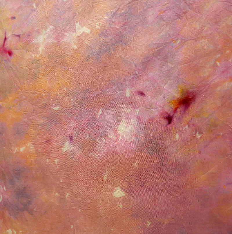
When using the powdered dyes, I ended up with spots of color where the dye powder landed directly on the fabric. You may find that desirable or not.  If not, use more ice and pile enough ice on top so that none of the fabric is directly exposed.

Flecks from powdered dye directly on fabric


The Fabric

I tried a variety of fabrics: cotton sateen, cotton printcloth, Kona, silk habotai, silk noil, cotton/silk charmeuse,dobby noil, and even a 50/50 poly cotton (I thought it was all cotton). The patterning came out with a softer edge on the silks than the cotton.  Both are beautiful, just different. As expected, the thinner fabrics have less patterning.

Silk habotai

Silk/cotton charmeuse

Silk dobby noil

Cotton


Time

I read that the color/pattern breakouts are due to the slow dyeing. Since I was doing it outside in 95 degree weather, it probably wasn't that slow.  It took from 1-2 hours for the ice to melt, and I let it batch for 3-4 hours after that.  I have not done any comparisons to see if longer batching time or longer time before the ice melts yields different color and pattern.  That will be my experiment for this fall/winter.

Wash-Out

I found very little excess dye run-off. I soaked the fabric in cold water for about 10 minutes.  Very little dye came out in the rinse after that soak.


Tuesday, July 17, 2012

More Ice Dyeing

I spent a few more days ice dyeing last week.  I'm really enthralled by the process.  It's my "new boyfriend", as Jane Dunnewold would say. Below are more photos of my results.  I have also documented the process for those of you who may not be familiar with it.  You can also google "ice dyeing" and you will find numerous tutorials and lots of ideas for alternate ways of setting this up.

Red violet and yellow green liquid dyes on cotton

Red, yellow and green powdered dyes on cotton sateen
Yellow and green powdered dyes on cotton
Blue and orange liquid dyes on silk/cotton
Tobacco, bronze and palomino gold powdered dyes on cotton
Red and green liquid dyes on cotton


This set up worked well.  I placed a tarp on the grass and anchored the corners into the ground. The fabric was raised above the surface with a plastic ceiling grid. The fabric was soda soaked and the dyes were applied while the fabric was damp.

The day the photos were taken, I used powdered dye sprinkled directly onto the ice cubes. Salt and pepper shakers work well for this. I used full size ice cubes made with ice cube trays.  The powdered dyes mix and mingle with the melting ice. Later in the week I experimented with different kinds of ice and with liquid dyes.
 

Once all the dye had been applied, I folded the tarp in half to keep the cloth damp.  This also proved helpful when the rain storm came through later that morning.


This is what the cloth looked like after the ice cubes melted.  Not very exciting.  But look at the finished cloth below.

Deep purple and jade green on silk dobby noil

Tuesday, June 12, 2012

Working with Resists - Tip #7

This week I'm winding up my resist Tuesdays series with my final tip - Have fun!  Isn't that why we create? Yes, we are expressing ourselves, adding beauty and/or meaning to the world and perhaps even healing ourselves in the process.  The time spent exploring and playing with new techniques allows us to do those things even better.

I hope that these posts over the past two months have inspired you to try working with resists. I would love to hear about your experiments. And if you are inspired to buy my book and try out the techniques, that's great, too! Please bear with me for a moment of shameless self promotion.  My book will be available next week (finally!) My shipment is on a FedEx truck at this moment, headed to San Antonio. I created eight silk scarves for the book using the different resist techniques. Anyone who orders the book from me before the end of June is automatically entered into the drawing. Below are photos of some of the scarves.

Happy Resisting!


Tuesday, December 6, 2011

Mixing Your Own, Part 2


I spent last weekend facilitating a workshop focused on mixing dyes from primary colors.  (Yes, that's where my last blog post came from.  I've had color mixing on my mind for the past week.) It's a class that I love to teach and I learn something each time I do.

We used primary colors to make a color wheel in light, medium and dark values.  Then we mixed each color with its complement to obtain a collection of low intensity colors and browns. We also overdyed each of the primary and secondary colors with each of the others.

A finished set of color wheel swatches

The objective was to give artists a good understanding of color mixing with dyes, the effect of using cool vs warm primaries and to train their eyes to really see the undertones in a color. The topic that seemed to generate the most discussion was using mixed colors.  We borrowed Jane Dunnewold's paper towel technique.  You get a paper towel moist and then sprinkle a bit of dye on it.  That allows you to see all the colors that make up a mixed dye color.  The companion set of fabrics (dyed in both silk and cotton) allowed us to also see the difference in color between a protein and cellulose fiber.


You could almost see the flash of a light bulb above everyone's head as they realized why they didn't always get the color they expected when using mixed dyes.

I think I gained a few "mix-your-own" converts. But just as important,  even the non-converts felt that they gained a better understanding of how to work with their pre-mixed colors.

The workshop reminded me how much I love to experiment with color.  It has inspired me to do some more color studies on my own.  As I said last time, working with color is a life-long journey!

Monday, February 1, 2010

Cloth to Dye For


I've been looking forward to teaching a week long workshop, Cloth to Dye For, at a retreat center that was scheduled to open in Florida this year. Unfortunately, they weren't able to meet all the state and local requirements, so the center won't open. I had that week blocked off on my calendar and several people were interested, so I'll be teaching the workshop at ArtCloth Studios in San Antonio instead.

The workshop focuses on a variety of ways to add color to cloth with fiber reactive dyes. Those new to dyeing will learn the basics of working with fiber reactive dyes and more experienced dyers will have an opportunity to combine techniques to create a surface rich with depth. Participants will choose a color palette for the week, and will gain an understanding of how those colors work together in a variety of techniques, including immersion, painting, pouring, and dripping. The workshop will also cover the use of thickened dyes and everyday objects to build a complex surface suitable for use in other projects or that can stand alone as a piece of artcloth.

If the sound of a week playing with dyes in warm, sunny San Antonio sounds appealing, you can find out more information on my website.

Monday, July 27, 2009

Color Studies - A Real Life Example


I have spent the past few days dyeing many small pieces of cloth to test colors for a commission I am working on. The triptych will be hung in the chapel of a local church and the colors must coordinate with the walls and trim. The walls are a sandy peach color and the trim is a darker terracotta color. I knew that color matching would take some time, and I allowed for that. In all this sampling, I have encountered some interesting and unexpected results.

I went to the church Tuesday morning with some paint chips in hand to determine the wall color. I figured that once I did that, I would be able to get the right dye tones. The first batch of color studies went pretty smoothly. I used various combinations of palomino gold, burnt orange, brick, pine cone and tobacco to create a pleasing palette that coordinated with the walls and trim. In my studio, the colors looked perfect.


My first surprise was how washed out the colors looked in the chapel. It is very dimly lit, and the colors did not show up at all. So, I had a hands-on lesson about how lighting can make color appear very different. Back to the studio for some more color studies. This time I used the same color combinations and proportions as before, I just added more dye. My second surprise is that even thought the colors and proportions were the same, the darker colors had a very different hue - I was expecting a darker version of the same color, but in some cases the color shifted and it did not work with the color scheme.


Back to the studio for another round of dyeing. This time the colors were right and I had a good range of light to dark values. I came up with two versions to try - a medium value version and a darker value version. Next step: dyeing a small version of the final product with each of the two color schemes to see which looks best in the chapel.


Related Posts Plugin for WordPress, Blogger...