Showing posts with label design explorations. Show all posts

Tuesday, February 14, 2012

Custom Printed Fabrics

Have you heard about the online companies that print fabric from your designs?  There are a number of companies who do so, including Spoonflower, Fabric on Demand and KarmaKraft. It's a fun way to create your own fabric, especially for those with limited space to use paints and dyes! You don't have to be able to draw, although that is one way to create a pattern.  I've been experimenting with a variety of ways to generate designs on Spoonflower. Below are photos of some of my designs.   View my entire collection on Spoonflower.

1. Reproductions of my hand-dyed and printed fabric.  I photographed the fabric, cropped out the portion I wanted and uploaded it to the Spoonflower website.


2. Reproductions of some of my resist-dyed fabrics


3 . Designs taken from black and white imagery I created.  These images were scanned into the computer, manipulated as desired and uploaded to Spoonflower.


4. Photographs - The first is a photo of my cat - not necessarily something I would use in my art, but it's a great photo and I wanted to see how it would come out. The second image was created by manipulating a photo in photo shop to create a black and white outline drawing of the photographic image.


One of the neat things about Spoonflower is that you can change the colors of the design after it is uploaded.  The following cloth was uploaded as a black and white image. 


Another feature is that you can choose from several repeat patterns.  There are several variations on the grid as well as a mirror repeat that creates a kaleidoscope effect.  The first image below is a half drop repeat, the second is the same image with a mirror repeat.


Saturday, March 5, 2011

Design Transformation


I've been doing a lot of brayer printing lately and have a wonderful piece of lacy fabric that makes a great pattern.  I've heard a lot about PhotoEZ for screen printing and wanted to try it, so I decided to transform this image into a screen.


Lace fabric

The first step was to paint the lace with black craft paint so it would show up when I scanned it into the computer.  The resulting image came out with a lot of gray tones, so I manipulated it in my photo software so it was only black and white.


Then I decided to try the negative image to see what that was like.


I liked that better, so that is what I used to create the PhotoEZ screen. PhotoEZ is essentially a piece of mesh covered with photo emulsion.  The website makes it sound so easy, but I was skeptical. It actually was very easy and came out perfectly the first time.  Basically, you place a photocopy of the image on top of the emulsion covered mesh and let it sit in the sun for 5 minutes. (There is more to it than that, but it comes with complete directions.)

After washing out the softened emulsion, I had a screen ready to go.


Here is what the print looks like:


 I love the idea of creating screens with some of the unique patterns I get with brayer printing.  I think I'll be making a lot more of these.  I hope it is a sunny spring!

Monday, January 31, 2011

Trying Something New

Ever since I started playing around with acrylic mediums to create texture on the edges of my collage-on-canvas, I have felt a pull to paint with them.  Now, I have never done any acrylic painting - just a little watercolor years ago.  It's the allure of texture - using gel mediums and modeling paste to create a 3D surface.  Up to now, it's just been that idea in the back of my head.  Then, at Quilt Festival, I bought the book, The Creative Edge, by Mary Todd Beam.  I also picked up Painting Abstracts by Rolina van Vliet. Both books have a number of exercises using acrylic paints. So, last week I gathered my supplies and got to work.


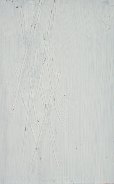
My first step was to cover several boards with gel medium and make marks on the wet gel to create texture.  I realized this was going to be expensive, because I was using a lot!  So I pulled out the wall patch compound and used that on some of the boards. I have one that has an acrylic base, which is important.  Without that, it will crack off the surface when it is dry. At least that has been my experience using it on the edges of canvas.

Beam recommends illustration board, but I used mat board since I have a lot on hand. After the medium/wall patch dried, I applied gesso so I would have a nice surface for painting.  Below are a few of my textured boards, ready to paint.


Scratches with a bamboo skewer


The medium was squeegeed through a piece of heavy lace.  Can't really see the lace pattern, but it has an interesting texture.


Here I used a spring whisk, part of a plastic ceiling grid and a skewer.

This is pretty much like using the sgraffito technique on flour paste, so I felt right at home creating these backgrounds.  Then I laid the first wash on one of them. That takes me back to my watercolor days. I love the soft effect even more with the textured background.  And when I paint over it, those colors won't bleed into the 2nd layer.


It's a slow going process, since I only have a short amount of time to devote to this right now.  But I like working in stages like this. And I know they don't look like much, but I am having so much fun doing this. The neat thing is that I don't really care what the end result is - I'm just enjoying the process!

Sunday, August 29, 2010

I See a Pattern Here...

When I came up with the idea of doing a series of pieces all with a similar vertical line composition, I thought I was doing something very different from my other work.  But then I became more aware of the composition of some of my pieces from earlier this year. 


Hmmm, I guess the vertical lines aren't so new after all.

After I noticed this pattern, I wondered what it was that drew me to the vertical composition. I see the vertical line as a symbol of growth, of a connection between the physical and the spiritual, between the earth and sky.   It also represents the chakras and the energy that moves up through our body, keeping us grounded to the earth and also connected to Spirit.  To me, the vertical line also represents a moment in time - this moment, which is all we really have. 

What does the vertical line represent to you?

Friday, August 20, 2010

My Latest Project

I'm a bit behind on the cloth I need to finish for the next ArtCloth Mastery Program session.  We are supposed to create a series of 4-6 pieces of artcloth.  Of course, I have all kinds of good reasons for not starting before now.  One of the main reasons is that, up until 2 weks ago, I did not have a plan.  All I knew was that I wanted to incorporate hand painting.  I finally had a brainstorm as I lay awake one night. 

I've been focusing a lot on design and composition since I started my daily design practice last fall.  (Actually it was more of a weekly practice, but that's another story.)  I've always taken an intuitive approach to composition.  But since I don't have a formal art education, I figured it was time for some "book learning".  I've been reading and doing a variety of small design and composition studies to translate the book learning into experiential learning.  I have also managed to incorporate design concepts into each of the classes I taught this year.

Through my design work and research on other artists (I've focused on the abstract expressionist movement) I find I've been drawn to vertical compositions.  I used that approach for one of the pieces I created for my last series, The Best Season, and I was really pleased with the end result.


So, I decided that I would use a vertical composition for all the pieces in my next series. There are a few other things I want to accomplish with this series, so here's my plan:

  • All pieces will have a vertical composition
  • All pieces will incorporate the use of resists
  • All pieces will be primarily hand painted with minimal to no use of silkscreens
  • Each piece will be a color study, incorporating either complements, or some color scheme based on color wheel relationships
I have started doing a series of fat quarter studies and then I will start on the larger pieces.  Stay tuned for photos as I work through the small studies.

Wednesday, April 28, 2010

Making Marks


This week I started experimenting with making marks. I chose a variety of brushes and other tools and played around to see what kind of marks they would produce. I was inspired by a friend of mine who took a strip of rubber and was able to come up with 15 different types of marks. This is all part of my desire to work directly on the cloth, rather than relying on screenprinting.


This concept of making marks isn't completely new to me. I have used it often with black paint on paper to come up with images that I could turn into a silkscreen, stencil or thermofax. This time, I am using thickened dye on fabric, to get a better understanding of what each tool can do.


I started with some basic brushes - a large round watercolor brush and a large square brush.


Then I moved on to a paint roller and some ice tongs.


A spring whisk and window chamois make interesting marks.


My favorites are a putty knife...


a rubber spatula...


and a wire whisk.


I'm running out of tools to try - time for a trip to the thrift shop!

Monday, March 22, 2010

Tribute to Helen Frankenthaler?


An assignment for the next ArtCloth Mastery class was to choose an artist, prepare a presentation about him/her, and create a work inspired by some aspect of that artist's style. I chose Helen Frankenthaler as my artist. That decision was made after spending time in the San Antonio Museum of Art, looking at the contemporary art section.

I was drawn to Frankenthaler's work mainly because of her use of staining. She was one of the early painters who worked on unprimed canvas with thinned paints. An approach similar to Jackson Pollack, but with a very different look. I felt that what she did was very similar to what I do on fabric.

As I did more research on her and her work, I was drawn to her work that was composed of large areas of color. Seemingly very simple, yet they had a depth and complexity to them. I would like to be able to capture that in my work. I feel there is a way to create depth and complexity without layers of screenprinting, but I haven't given myself permission to try it yet.

Frankenthaler works very spontaneously, painting without a pre-set plan. I wasn't quite ready for that yet, so I played with a design exercise from one of the books I've been reading. You take a piece of construction paper and cut or tear it into pieces. Then arrange some of the pieces on top of a contrasting color paper to form a composition. I added a third color because I wanted to use a split complementary color scheme. I wasn't necessarily trying to create a piece that looked like Frankenthaler's, rather I wanted to try to capture the essence of her work. Below is the paper study I did first.


Then I set out to recreate it by painting dyes on fabric. I used silk noil, thinking that might react more similarly to canvas. I did not thicken the dyes because I wanted some blending to occur. The end result looks more like it was inspired by an impressionist. The dye did not absorb easily into the fabric, so I ended up with more brush strokes than I wanted. And the colors were not as bold as I wanted.


So I don't think I met the criteria for the assignment, but I think the piece has possibilities. It still needs some work. Maybe some additional hand-painting or stitching.

Friday, January 29, 2010

...and more repetition


Yesterday I took the motif that I created for the previous day's design exercise and continued my repetition studies. This time I changed the orientation on the repeat pattern.


Then I played around with isolating smaller components of the pattern.


I find this pretty interesting - especially isolating segments of the repeat pattern. I can see the potential this process has for creating new imagery.

Wednesday, January 27, 2010

Repetition

Hmmm, this theme keeps coming up. Repetition was the focus of a surface design symposium this weekend at the Southwest School of Art & Craft. Ilze Aviks, an artist from Colorado, spoke on the topic. There was also a panel discussion with Mary Ruth Smith and Liz Axford moderated by Jane Dunnewold. How serendipitous that my design exercise for today was on repetition.


The assignment was to create a repeat pattern using a simple design. At a loss for an image to use, I scanned my studio for ideas. This stylized leaf was my inspiration:


So I abstracted it a bit and came up with this design:


The first part of the assignment was to create a repeat pattern with the design.


Then, I was to reverse the image so positive becomes negative.


The next step was to create the same pattern, but use color. I chose to use four colors and to make each "block" a different combination of those four colors.


Finally, I decided to repeat the pattern with colors, but make each block the same combination of colors.


As a repeat, it loses it's resemblance to a leaf. And the last version in color reminds me of watermelon! If I had switched the purple and green, it would look even more like a watermelon with a green rind and purple seeds. I'm intrigued by this exercise. I'm thinking of repeating it with the same design, but altering the orientation for each block.

Related Posts Plugin for WordPress, Blogger...