Many artists working on a flat surface continually strive to create the illusion of depth and texture. There are many printing and dyeing techniques that accomplish that goal. However sometimes the work calls for an element that is raised above the surface of the cloth. Do you want to create real texture, not just the illusion? Over the next few weeks I'll highlight some of the techniques I use to add dimension.
Hand stitching in a contrasting or complimentary color adds a nice accent. If you don't consider yourself good with a needle - no problem. I did not come from a stitching background. When I first started using stitch seven years ago, it felt very awkward. But I have come to love it. I find it calming to sit with a needle and thread. You don't need to know any fancy stitches - a simple stitch repeated many times can result in a rich surface.
Use a thicker thread (4-6 strands of embroidery floss or size #3 or 5 of pearl cotton) for more impact. Embroidery floss is made up of six strands that can be separated to create the desired thickness. While that sounds great because you have the flexibility to create the thickness you want, beginners may find it harder to stitch with the floss. Sometimes the plies separate while stitching, leaving a loose thread in some stitches. Pearl cotton has multiple plies, but they are non-divisible. It comes in several thicknesses - the smaller the number the thicker the thread.
 |
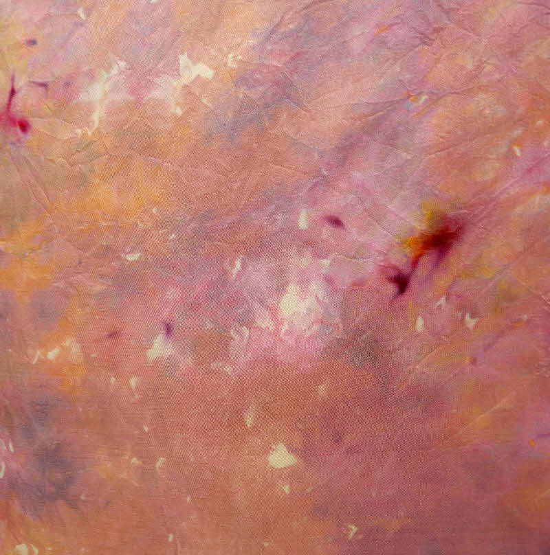
| This Moment, detail view |
 | ||
| This Moment, detail view |
 |
| This Moment, 80" x 24", silk noil |
 | |||||
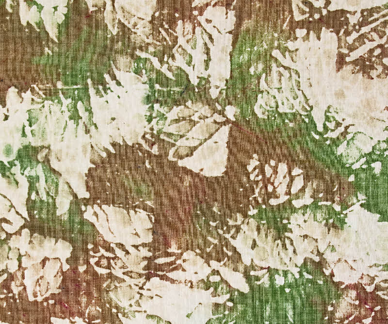
| Marking Time, detail view |
 |
| Marking Time, 80" x 24", Silk noil |
The decision about what stitch to use was easy. These two pieces explore our emphasis on "marking time" - looking to the past or future rather than focusing on the current moment. The universal symbol for counting seemed to make sense as a stitched element. As did a double chain stitch to complete the larger circles on This Moment.
Next Tuesday I'll highlight a few pieces with hand beading.
If you are intrigued and would like to explore several ways to add dimension, join me later this month in San Antonio for Three Dimensional Texture on Cloth, a 2 day class at the Southwest School of Art.