Tuesday, December 29, 2009

Proportion and Balance

For my daily practice for the artcloth mastery program I've been doing the assignments from an old textbook on art design. Today's design study was on proportion. The first step in the assignment was to create a balanced composition using basic geometric shapes. I cut shapes out of black paper and glued them to white paper. Here is my first composition.


The second step was to enlarge one of the components so it was out of proportion, but keep the same basic composition. I chose to enlarge one of the vertical lines and make it a rectangle.


The third step was to keep all the components from the second step, but to rearrange them to make them more balanced. I played around with a number of compositions, some that were completely different from the first composition. I ended up with one that was very similar, mainly because I wasn't pleased with any combination that separated the two horizontal lines, or had them elsewhere on the page. Amazing how the slight change between the second and third composition affects the overall visual balance.


Saturday, December 26, 2009

ArtCloth In Progress


Here is another piece I've been working on. This is a study in overdying and discharge. I'm using a good quality cotton. The first step was to dye it burnt orange. I used low water immersion with a pretty tight scrunch, so it ended up with a lot of light space. Before I overdyed it, I discharged the net pattern with bleach. Then I applied soy wax with a stencil, to keep some of the orange after it was overdyed. I overdyed it in blue.

This is a good example of some of the variables involved in mixing complements. Shouldn't I get brown by overdyeing blue and orange? In theory, yes, but since the first layer was so light, the blue and orange mixed to make an olive green color. If I wanted brown, I would have to have made the burnt orange a stronger value. Another variable is room temperature. Both the orange and the blue ended up lighter than I expected, based on the amount of dye I used. But it was very cold in the studio that day, so that likely had an impact on the depth of color.

It ended up pretty much as I wanted - with some areas of the original color, some areas of blue and some areas of the two mixed. Next step is to create more value contrast with additional printing.

Wednesday, December 23, 2009

Journey


I've been working on a cloth that I've named Journey. It is still in process, but I thought I'd share what I've done so far. It's a beautiful piece of silk, 5 yards long, 28" wide, that was given to me by a friend. I have kept it for two years, because I felt that I needed to do something "special" with it. I found it this summer while cleaning out my studio and decided to finally work on it. I'm using it as a study of resist techniques and color blending.

My first step was to apply flour paste to the entire cloth. I learned a good lesson there - wear knee pads when working on something so big! It was too long to do on the table, so I had to work on the floor. I also had to deal with kitty paw prints from the studio cats. Oh well, just more texture, right? After the flour paste dried, I brushed on thickened dye in 3 colors, blue, green and purple.

The next step was to block off the edges (I was trying to create a path along the entire length of the cloth). I screenprinted on Presist with a texture screen and then used a freezer paper stencil and thickened dye to print the flagstone path. The Presist left very subtle value variations on the path.

My color choice for the path was driven by some experiments I've been doing with color gradations - blending colors with their complements to get a range of colors in between. I have done a lot with immersion dyeing the past few months, but not with thickened dyes. So, my plan for this cloth was to start with blue at one end, then blend blue with orange to get a range of colors. Then I'd blend red with green and finally, yellow with purple.


For the edges of the path, I screened on Elmer's Gel Glue as a resist with a fiber texture thermofax and hand painted with the brown that comes from mixing the complements.


I'd like a darker value on the edges, so my plan is to paint over it again with the same color. But first, I added some soy wax speckles, so that some of the current color will show through. Unfortunately, the cloth met with an accident yesterday, and I have a 3" tear on the edge of the yellow section of the path. Arghhhh! I could just cut off three feet, but I really liked the length of it. So, now I'm trying to figure out ways to salvage it, while still honoring the design. I'll post more as I get it worked out.


Sunday, December 20, 2009

The Moon


I've been working on a piece for my 10,000 Flowers series titled "The Moon." I'm creating the series as part of an assignment for the ArtCloth Mastery Program. The series focuses on a favorite poem. I created four pieces with the same theme this summer, but I wasn't pleased with the way they turned out, so I'm trying a completely different approach.

This time I'm using a rayon, linen blend. It is a wonderful fabric with the look of linen and the soft drape of rayon. I used fairly bright colors for the last series, so this time I'm using a more muted color scheme. I also wanted to incorporate overdyeing and the use of resists.

The first step was to block off the large circle with freezer paper, then apply flour paste to the entire cloth. My intention was to scratch into the damp flour paste the words of the poem. But because the cloth was so long, by the time I got all the flour paste on, the paste was too dry to scratch into it. It ended up taking off gobs of paste, rather than creating a fine line of text. So, I abandoned that plan. Once the paste was dry, I brushed on thickened dye in a dark brown.

My vision was to have a value gradation so that the top of the cloth would be lighter than the bottom. I dyed it blue green first, then overdyed it orange. It sounds like a strange combination, but it makes an interesting color. It was a pretty tedious process - I used six value gradations so there was a lot of math involved in computing the dye/water ratio! It took several samples to get the color and the amount of gradation the way I wanted it.


Before I dyed it, I used an acrylic medium resist. Acrylic medium works well to block penetration of the dye. It usually takes up some of the color, so you end up with a lighter version of the dye color. I screenprinted on gel gloss medium with a thermofax in a small dot pattern. I tested all this out on a sample before I did my large piece. I compared textile medium, matte gel medium and gloss gel medium. The gel mediums tended to resist the dye better.

After I did the first dye bath, I applied soy wax so that I wouldn't lose all of that blue green. My next step is to paint the "moon" with thickened dye. I have been playing around with colors for that, mostly focusing on yellow oranges to denote a harvest moon. I wasn't satisfied with any of the colors I tried. Finally, I realized that with the background being more reddish orange, that is the direction I need to go. So, now I'm off to sample some red-orange colors. I'll post more photos as my work progresses.


Thursday, December 17, 2009

Design and Composition

Two months ago I began a daily practice involving design and composition. It was an assignment for the ArtCloth Mastery program. We were to choose some type of daily practice that would further our art. I decided to focus on design issues, so each day, I have been analyzing composition and design techniques in famous works of art. This week I transitioned to creating a small study each day based on some aspect of design principles. For now, I'm using the assignments in an art design textbook I picked up at Half Price Books.


The first assignment was to create a study that included a black circle, and make the black circle dominant. Then, I was to create another picture, with the same black circle, same size, same place, but make it so that it wasn't dominant. I used my husband's acrylic paints. I was a bit limited on color, because I could only open the red, black and white tubes. Below is the first composition with the black circle dominating.


I'll be honest - I didn't really plan the composition. I just started brushing on paint. Not exactly a masterpiece, but the black circle does dominate.


For the second composition, I created a light glaze by mixing the red paint with gloss medium. I wanted just a sheer layer of color over the black circle. I thought the shine of the glaze would make the circle less dominant. Then I added a black vertical line (using matte medium with the black, so it stands out from the glossy red finish). The glaze over the black circle was too sheer, so I went over it again, but that ended up too thick. It really obscures the black circle - I think that's probably cheating. Good thing it's not for a grade!

Monday, December 14, 2009

Back in the Studio

Marshall and Pretty Girl enjoy the warmth of the space heater.


I spent six days in the studio last week after a long hiatus. Ahhhhh! It was wonderful. My routine was disrupted this summer - the unusually high temperatures made the studio unbearable, so I decided to work at home. Of course, it's so easy to be distracted at home. And once the cooler weather arrived, I was so out of the habit of going to the studio, I just never got back to it. I've also been in super-hero procrastinator mode. That, along with a lack of inspiration has led to a pretty long dry spell.

I've learned that there is an advantage to having a regular discipline. I usually treat my studio time like a job. I set aside three days a week and spend the whole day there. I schedule errands, computer time and meetings on my days "off". Even if I don't feel like working, or I don't know what to work on, I stay at the studio, and eventually the inspiration comes. It has the advantage of no computer, no phones, no floors to be mopped , no distractions to keep me from creating. Well, there are floors to mop, but we are a little more relaxed about that at the studio.

So, what have I been working on over the past week? A lot! I started five different pieces of artcloth. More about that will be coming over the next few weeks. They are all in various stages of completion, with 2-5 layers of printing and dyeing. Today I discharged a couple of scarves I had dyed that were just not thrilling me.


This is a pashmina shawl. It started out olive green, but it was a bit boring, so I manipulated it tightly and overdyed it in tobacco (the dark areas were tobacco). It still wasn't right, so I overdyed it red. The color was nice, but it needed more contrast, so I used a stencil and discharged a pattern on it.


Much better!


The second scarf I worked on is a nice, texured cotton scarf. I used low water immersion to dye it. I was into orange and purple at the time, so that is what I used. But the purple must have been too blue, because the scarf came out mostly green. It was ok, but just not great. I screenprinted it with a photo emulsion screen using bleach. (Which, by the way, is not a great idea, because the bleach does break down the photo emulsion. But I thought maybe if I worked quickly it would be ok. It wasn't.)


Just a little bit of pattern and contrast, and it looks much better.

Three things in the dye bath waiting for me to wash out tomorrow. I'm putting in more than my usual three days, but since I'm taking next week off, I figure I better try to keep the momentum going!


Tuesday, December 8, 2009

It's a Boy


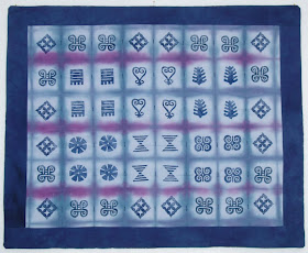
My step-daughter gave birth to her first child a few weeks ago. I made a baby quilt for the first two grandchildren, so I continued that tradition by creating an adinkra quilt for the new baby. I stamped the adinkra symbols on the quilt top two months ago, but as I am so proficient at procrastinating, I waited until the last minute to actually sew it together.


Adinkra cloth is particularly suited for celebrating a new life. Each cloth carries its own message, based on the combination of symbols used. When I create a baby quilt, I usually choose symbols to reflect the qualities I wish for the newborn as they make their way through life. For this quilt, I chose symbols to represent:


Learning from the past


Strength and humility


Ability to adapt to change


Safety and security


Reconciliation


Creativity


Resourcefulness


Ability to withstand hardships


Because the fabric came out of the dyebath with such a defined grid, I chose not to hand stamp gridlines, as is traditional. Instead, I let the dye pattern be the grid to contain the adinkra symbols. My sewing machine was acting up, so I decided to hand-tie it instead of quilting. I used pearl cotton and made small vertical stitches on the front, which I tied in back. I love the combination of traditional techniques from different cultures paired with a contemporary approach to design. I guess the quilt was a success, because it received the studio cats' seal of approval. (But so would anything that is soft and cuddly.) Time now to remove all the cat hair and send it off to our new grandson.